Quick Answer
- Apple gave us a first look at the upcoming versions of iOS, iPad OS, and macOS at WWDC, and the highlight was the all-new interface with transparent and blurred backgrounds.
- It would have been better if Apple had provided a slider to adjust the blur levels precisely, but we can only keep that on the wishlist.
- While this change adds a fresh coat of paint to the operating system, early users who installed the developer beta have complained about several flaws with the new design.
If you are disappointed with Apple’s new Liquid Glass software design in iOS 26, then you are not alone. Apple gave us a first look at the upcoming versions of iOS, iPad OS, and macOS at WWDC, and the highlight was the all-new interface with transparent and blurred backgrounds. While this change adds a fresh coat of paint to the operating system, early users who installed the developer beta have complained about several flaws with the new design.
The most common grievance is reduced visibility in the notification shade, where users are not able to read their notifications properly. In this guide, let’s see how you can opt out and disable the Liquid Glass transparent design on iPhone, iPad, and Mac.
Disable Liquid Glass in iOS 26
The developer beta of iOS 26 is available on all devices starting with the iPhone 11. The update also includes options to adjust the blur levels of the new Liquid Glass design. However, the feature is not easy to find and is buried in settings. Here’s how you can access it:
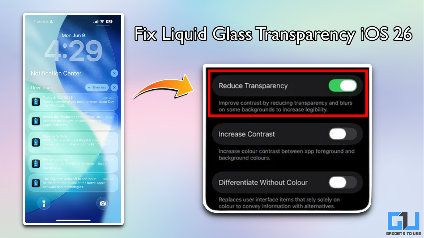
1. Open the Settings app on your iPhone.
2. Navigate to Accessibility and go to Display and Text Size.
3. Enable the Reduce Transparency toggle.
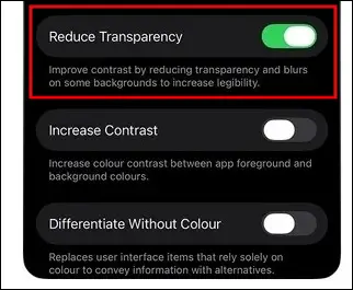
This will significantly reduce the transparency of the background in iOS 26 and improve the visibility of text and notifications. It retains the blur effect, so you get a taste of the new Liquid Glass design without having readability problems.
It would have been better if Apple had provided a slider to adjust the blur levels precisely, but we can only keep that on the wishlist. Hey Apple, are you listening?
Everything Wrong With Liquid Glass Design in iOS 26
Before we start discussing the problems with the Liquid Glass design, let’s first look at the pros. Apple, we absolutely appreciate the idea of revamping iOS, iPad OS, and macOS to make all operating systems uniform. The transparent and blurry backgrounds are also a great idea; it surely feels refreshing and a much-needed visual change. But the execution could have been better, especially considering the high standards that Apple has set with its software refinement.
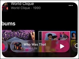
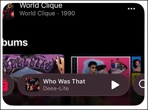
Starting with the quick settings panel. The translucent design does not have enough blur to differentiate the panel from the background. This makes it very difficult and confusing to read the settings icons. It’s not visually appealing either, and this feels like an unfinished design choice.
The notification text is also difficult to read with the new design. It lacks contrast, where the light-coloured text is not easily visible. If you have a light coloured wallpaper, then the text becomes almost invisible.
The Liquid Glass design also struggles with brighter backgrounds. For example, if you try to unlock your iPhone while playing music, the passcode section does not blur the music track poster enough, making it impossible to spot the buttons. This mainly happens on posters with brighter colours, but Apple should have seen this coming.
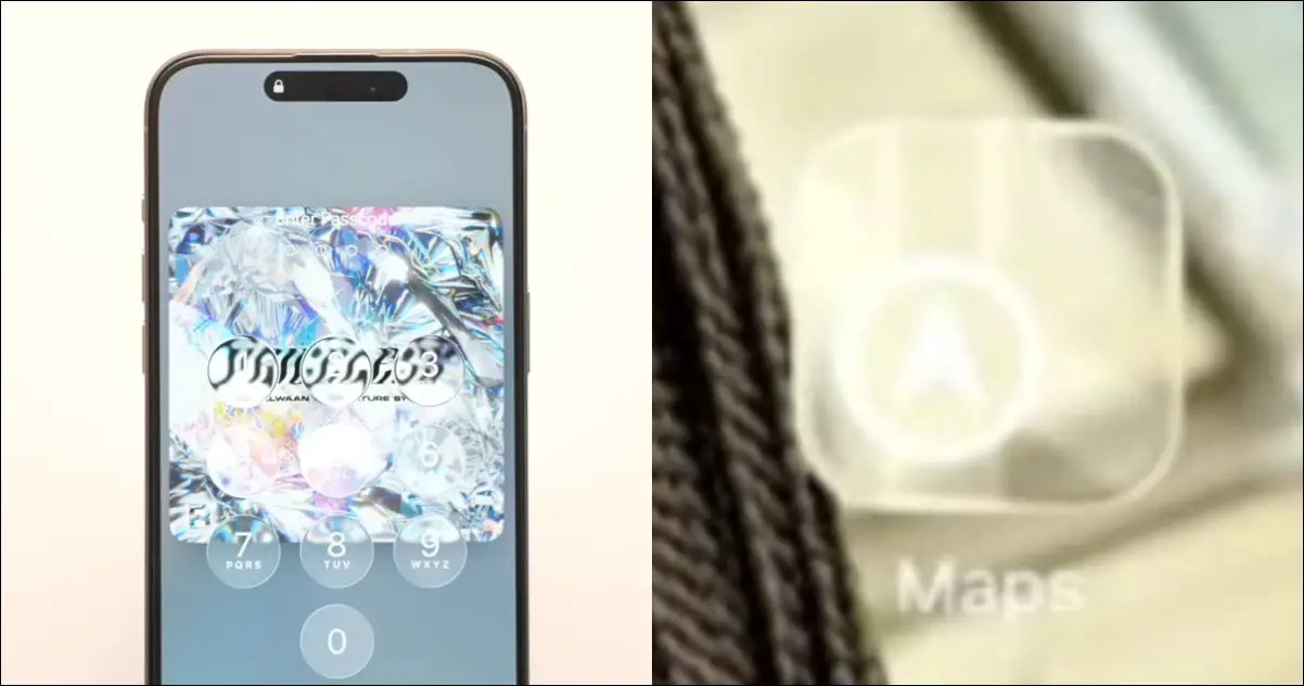
The app icons also appear to have major visibility issues on third-party apps, where the icon is barely visible. For people with vision-related problems, this can be extremely difficult to even spot the app, let alone trying to navigate through the interface.
Considering this is just the developer preview, Apple will surely fix these bugs. This is the biggest overhaul in Apple’s software design history, and hence, such problems are expected. However, the company has not acknowledged these issues yet.
FAQs
Q. Which iPhones will get iOS 26?
Any iPhone with the Apple A13 chip or newer is eligible for the iOS 26 update. This includes all iPhones launched after the iPhone 11.
Q. What is the release date of the iOS 26 stable version?
iOS 26 stable version will be released with the upcoming iPhone 17 Series. The launch is expected in September 2025.
Q. How to install iOS 26 developer beta?
You need to first register in the Apple Developer Program using your Apple ID. Once done, you will receive the iOS 26 developer beta as a normal OTA update on your iPhone.
Wrapping Up
The Liquid Glass design in iOS 26 is a refreshing design change. However, the quick settings panel and notification shade have some major visibility issues. The temporary fix is to reduce the transparency levels from accessibility settings, but Apple should fix this problem with the upcoming update.
You may also like to read:
- 9 Ways to Lock Apps on iPhone With Passcode, Face ID, or Touch ID
- Why iPhone 15 Pro Is A Better Buy Than iPhone 16 Pro?
- Find Out If Your YouTube video Used To Train AI By Apple
- 7 Ways to Get Circle to Search on iPhone or Any Android Phone
You can also follow us for instant tech news at Google News or for tips and tricks, smartphones & gadgets reviews, join the GadgetsToUse Telegram Group, or subscribe to the GadgetsToUse Youtube Channel for the latest review videos.